Thesis
In his book entitled “Principles For Navigating Big Debt Crises”, Ray Dalio developed a framework to identify market bubbles. As seen in the chart below, the gist of the framework is a seven-point checklist. These signs include high prices relative to traditional measures, a large number of new buyers entering the market, broadly bullish sentiment, et al.
Source: Principles For Navigating Big Debt Crises By Ray Dalio
The thesis of this article is to argue that the current market shows several of the above signs. I actually think the market is showing all 7 signs currently. Furthermore, I will argue that the bubble signs are more severe in the tech sector, and less severe in other sectors (such as value or small cap).
However, in this article, I will examine two signs in particular: the first one (high prices) and the fifth one (new market participant) for two reasons. First, I want to limit the article to a reasonable length. And secondly and more importantly, other aspects such as tightening risks and the use of leverage at a macroscopic scale have been a frequent topic on SA. Thus, here I want to examine these two aspects that are less often discussed.
In the remainder of this article, I will use the Vanguard S&P 500 ETF (NYSEARCA:VOO) to approximate the “overall market” represented by the S&P 500 index. And I will use the Invesco QQQ Trust ETF (NASDAQ:QQQ) to approximate the tech sector. As explained in my earlier article, the advantages to use a mature ETF instead of the market indices themselves are:
- It is much easier for me to pull ETF data than market indices data. And I assume it is the same for the readers too (in case some readers want to verify or extend my analyses).
- Historical data has shown that large mature ETFs such as QQQ and VOO track the underlying index closely, and as such, the error involved in this approximation is negligible.
- And finally, as a side benefit, by anchoring the discussion with a specific ETF, the discussion can be a bit more concrete and actionable. After all, many more investors express their view on the “market” via specific ETFs rather than trading the index itself.
VOO vs QQQ: basic information
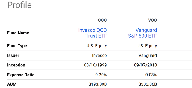
Both VOO and QQQ are large funds with a long history (and therefore offering plenty of historical data) in their own space. QQQ was launched in 1999. It tracks the tech-oriented NASDAQ 100 index and is therefore considered a large-growth fund as seen in the chart below. As one of the largest funds in the tech space, it boasts more than $190B of AUM and is ranked the second most traded ETF in the US as of Mar 31, 2023 (based on its average daily volume traded). Similarly, VOO is one of the largest EFTS tracking the S&P 500. It has an even larger AUM of over $300B. Note that VOO features a much lower expense ratio of 0.03% compared to QQQ’s 0.2%.
Source: Vanguard data Source: Seeking Alpha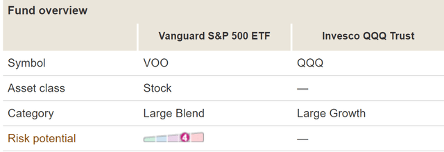
Bubble sign 1: high prices
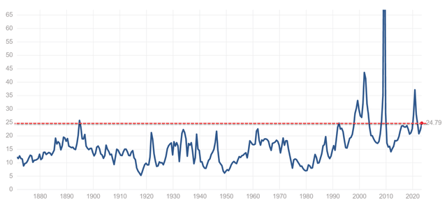
With the above information, let’s dive in and examine the bubble signs in depth. And let’s start with high prices. As seen in the chart below, VOO has historically traded with a P/E ratio in the range of 17.2x to 28.9x (10y Range) and its current P/E ratio stands at 24.79x. Its current P/E ratio is about 23% above its 10y Median of 20.2x.
It is difficult to fully visualize the significance of a 23% premium until we put it in a broader context (see the second chart). Its current valuation is among the highest level in the past 140+ years. Fortune published a report in July 2021 to argue that the “S&P 500 has only been this expensive for 4% of the past 140 years”. At the time of that article, the S&P 500 was trading at 26.5x P/E. The current P/E is only about 6% lower than that. Plus, you have to bear in mind that the current risk-free interest rates are much higher than those in July 2021. As a result, benchmarked against risk-free interest rates, the current valuation is closer (or even higher as argued in this article) to the July 2021 level than on the surface.
The picture for QQQ is even more concerning. As seen in the first chart below, QQQ has historically traded with a P/E ratio in the range of 19.7x to 36.2x (10y Range) and its current P/E ratio stands at 35.8x, which is within 1% of its 10-year peak valuation. Its current P/E ratio is about 48% above its 10y Median of 24.2x. In QQQ’s case, there is no 100-year historical P/E data that I can find. So, I will contextualize its current valuation premium in a different way (which is along the line of the second item on Dalio’s checklist). Assuming a generous 6%~8% expansion rate for the general economy, a 48% premium would A) either take 6 to 8 years of growth to catch up or B) requires the tech sector to outgrowth the general economy by a large margin. Even if the tech sector grows at 12% a year (i.e., about doubling the overall economy), a 48% premium would still take 4 years of growth to catch up.
Source: gurufocus.com Source: www.multpl.com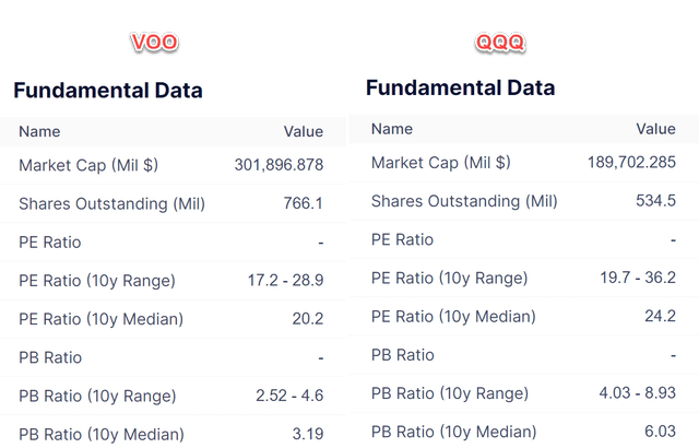
Bubble sign 2: new participants
Now, onto the 2nd warning sign. A large number, actually it is not an exaggeration to say that a record number as shown in the next chart below, of new buyers have entered the market in the past 1 year or so. This is considered a bubbling sign (not only by Dalio only BTW) for good reasons. It suggests that there is a lot of demand for stocks, and buyers are willing to pay prices far above (as argued above) their fair value. According to Vanda Research, retail investors have spent a record $1.51 billion a day in the US markets during the month of February 2023.
Source: Vanda Research 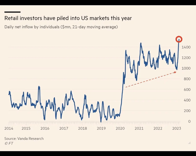
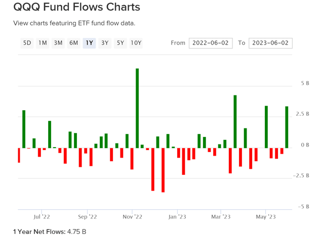
Specific to QQQ and VOO, the picture is very similar as shown in the two charts below. Actually, given the scale and popularity of these two funds in the respective space, I would expect the inflow of new funds into these two ETFs to be far above average. To wit, the first chart below shows that VOO’s fund flow is completely dominated by inflow in the past year. The fund only had 5 weeks of outflow in the past year, and its net flow totaled a whopping $31.2B. In other words, its net inflow in the past 1 year is more than 10% of its current AUM. As a more actively traded EFT, QQQ’s fund flow fluctuated more as shown in the second chart below. However, overall, the fund also attracted a sizable net inflow in the past year, totaling $4.75B.
Source: etfdb.com/etf Source: etfdb.com/etf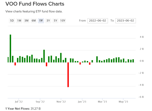
Risks and alternative ideas
To recap, I am seeing many (if not all) of the 7 warning signs that Ray Dalio developed to identify market bubbles. I concentrated on two of the 7 warning signs: high valuations and new market participants. I also touched on the risk that the current valuation multiple (especially in the case of QQQ) implied rapid future growth far outpacing historical economic growth rates. Other risks include the general use of high leverage after the epic QE during the COVID, the tightening risks ahead due to persisting inflation, and also the concentration risks (again, especially in the case of QQQ). The return in the overall market this year is dominated by a few companies, which are perceived to benefit from the AI boom. To wit, my analyses show that a total of only 6 companies (Microsoft, Google, Amazon, Meta, Nvidia, and Salesforce) have contributed to about 50% of VOO’s return YTD and almost 55% of QQQ’s growth of 54%.
Source: Reuters Graphics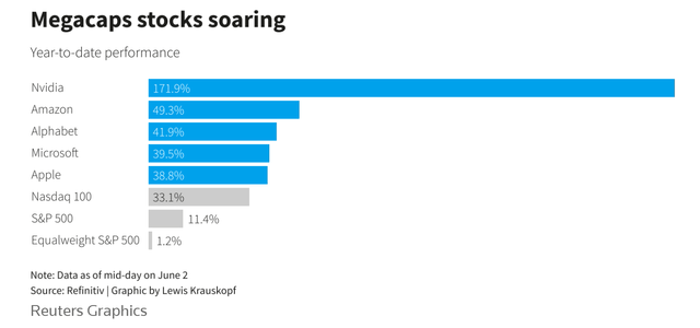
By this time, if you see the signs of the bubble as I see them, then the next logical question is what are the alternatives ideas? The valuation risks are unevenly distributed. My view is QQQ (or other equivalent tech funds) have higher risks, VOO’s risks (or other equivalent large-cap blend funds) are relatively lower, and value and small caps have even lower risk premiums. In particular, the valuation gap between QQQ (i.e., the Nasdaq 100 Index) and small caps (i.e., the Russell 2000 Index) is not at the highest point – the same level as that before the burst of the dot-com bubble in 2000 according to the following Blomberg data.
Source: Bloomberg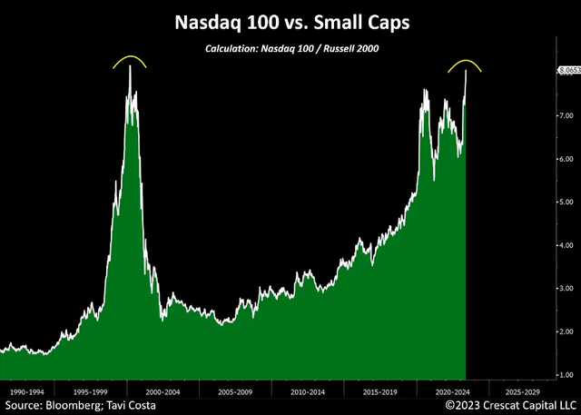
As a result, investors could consider replacing VOO with a total market fund such as the Vanguard Total Stock Market Index Fund ETF (VTI). As you can see from the next chart below, VTI is a fund that we actually hold as part of our core portfolio instead of VOO or QQQ. Compared to VOO or QQQ, VTI provides exposure to mid-cap and small-cap for better diversification and also hedges against the valuation risks concentrated in the large-cap space. Investors who have more risks tolerated could consider a concentrated exposure to small-cap funds such as iShares Core S&P Small-Cap ETF (IJR) or iShares Russell 2000 ETF (IWM) to bet on the above record-level valuation gap.
Finally, for exposure to the tech space, niche sectors such as the SPDR S&P Biotech ETF (XBI) are also attractively valued in our view (and also provide concentration exposure to the small caps at the same time). And our replacement for QQQ might seem a bit counterintuitive on the surface. As seen in the chart below, we use the ProShares UltraPro QQQ (TQQQ), a leveraged QQQ fund to gain exposure, which seems to increase our leverage to QQQ on the surface. However, by controlling its target allocation (currently 8.6% as seen), we actually have lower exposure in absolute dollar amount. Also, following a disciplined approach (detailed in my earlier article), an optimal balance could be obtained between the volatility decay and volatility boost associated with leveraged funds to provide alpha. All told, with these alternative ideas, our portfolio has been leading the overall market by a small margin (so far).
Source: Author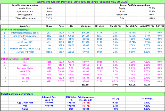
Read the full article here


